Candlestick charting originated in Japan, as far back as the 1600s with rice traders who actually drew the candles on rice paper. It took hundreds of years for the western world to become aware of this technique. Trader Steve Nison is credited with bringing this style to the Western Hemisphere in the 1990s. You can find candlestick charting in many trading systems and software packages.
A single candlestick represents prices for the open, close, high and low of the time period the chart is displaying. The color of the candle determines if the closing price was higher or lower than the opening price. A white candle indicates that the close was higher than the open and the reverse is true for a red candle.
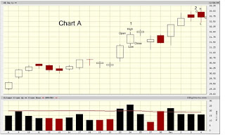
Chart A is a recent daily chart of Verizon.
 Click Chart to enlarge
The candle in exhibit 1 shows that the opening price for the day was a little lower than 31.50 and the closing price was between 31.75 and 32.00. Therefore, since the close was higher than the open, the color of the candle is white. The small wicks on the bottom and top represent the high and low of the day; near 32.00 for the high and close to 31.25 for the low; but again it is the open and close that determines the color, not the high and low. Exhibit 2 shows a candle that closed lower than the open with a high near 33.00, a low at 32.50, an open a little higher than 32.75 and a close a little lower than 32.75. The color is red because the close was lower than the open. As a reminder, if we were looking at a 5 minute chart, then each candle would represent the open, close, high and low for that particular 5 minute period, instead of the entire day.
If we have a series of candles in an ascending or descending sequence, we can easily draw trend lines to show the momentum direction of the stock. Chart B shows Pacific Gas & Electric with trend lines.
 Click Chart to enlarge
By drawing a line as close as possible through the lows of the candles, we see that in Exhibit 1, the stock was clearly in an uptrend for 10 trading days. From the 11th session, we see the beginning of a declining stock price that continued for the next 12 trading days, then a slight upward movement in 3 with a choppy sideways action in 4, followed by another upward swing in 5. Trends combined with other indicators, that will be discussed later on, contribute to trading decisions for buying and selling.
There are a number of candlestick patterns that indicate potential tops and bottoms. The first one we will examine is called The Doji. See Chart C for a top reversal Doji on the General Electric chart.
 Click Chart to enlarge
This pattern appears as a cross and is formed when the opening and closing prices are the same or very close to being the same. When this happens, no bar is created, just a thin horizontal line intersecting with the vertical line that shows the high and low for the period. It is most potent after a significant uptrend or downtrend, and shows that buyers and sellers are indecisive about the next price movement. More importantly at a top, the Doji indicates that buying interest is weakening. This decline combined with indecisiveness could lead to a trend reversal, which at times just means sideways price movement for a while before a new wave of buying occurs. However, it could also mean a major reversal to the downside. In the GE chart, we see a classic Doji at the top, followed by a series of downward spiraling candles showing a strong downtrend. Of course nothing is perfect, so it is important to get confirmation for the next day or two, to make sure that the trend reversal is really building momentum. In this example, the Doji worked very well in finding the top.
In Chart D, for Honeywell, we see a Doji at the bottom after a steep downtrend. The next two days confirm that a new uptrend is taking place.
 Click Chart to enlargeThis is another example of a classic Doji reversal.
It is important to realize that you cannot follow this pattern or any other pattern blindly without doing research into the stocks you are interested in trading. See how the target stock has reacted to reversal Dojis in the past. Even so, nothing is guaranteed and the price could always blow right thorough the pattern. The idea is to gain experience over time and observe what works best for the instrument you are trading. In Part 3, will look at more popular candlestick patterns.
C. Cohn